Responsive web design
Responsive web design that works on every screen.
Sites that look and work flawlessly on phones, tablets and desktops — where your customers actually are.

Responsive web design
Sites that look and work flawlessly on phones, tablets and desktops — where your customers actually are.
Mobile-first
Most of your visitors arrive on a phone — and they leave fast if your site fights them. Responsive web design in Ahmedabad means one site that adapts perfectly to every screen, part of our web design service. Fast, flexible and built mobile-first, so nobody gets a broken experience. We obsess over how the site feels in a thumb’s reach, because that frictionless experience on a phone is what keeps a visitor reading instead of leaving.
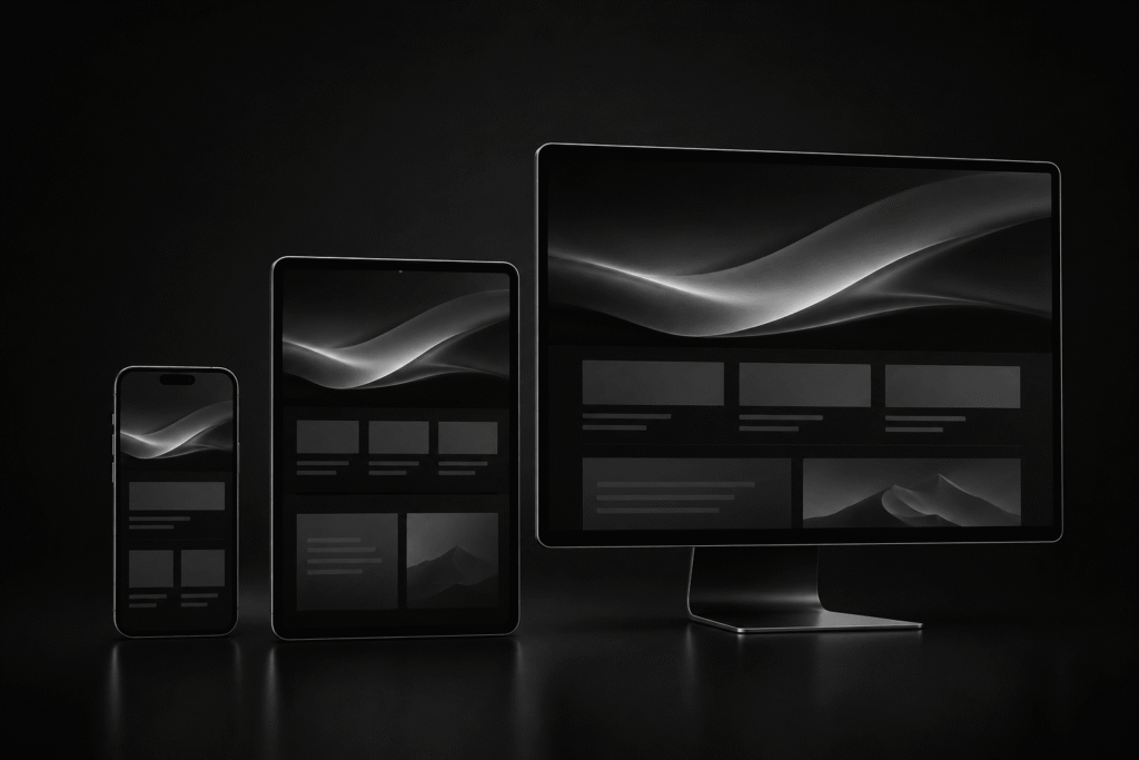
Why it matters
Google ranks on mobile-first, and most browsing now happens on phones. A site that only works well on desktop is losing the majority of its visitors. We design and build for the smallest screen first, then scale up — so every visitor gets a fast, clean experience. Test it on a real phone and you’ll feel the difference a mobile-first build makes.
How we build
We build fluid, flexible layouts that reflow naturally across phones, tablets and desktops — no separate mobile site, no pinch-and-zoom.
We design for the smallest screen first, then enhance for larger ones, testing on real devices so it works everywhere it matters.
Responsive isn’t just resizing — it’s fast load, easy taps and readable text on every device, so visitors stay and act.
A single site that looks sharp and works smoothly across devices and browsers, on SEO-friendly, fast foundations.
Which is everyone — local businesses, e-commerce, services and corporates whose customers browse on phones. If a meaningful share of your traffic is mobile (it is), responsive design isn’t optional.
Responsive isn’t an add-on we charge extra for — it’s how we build every site from the first wireframe, so the mobile experience is designed deliberately rather than squeezed in at the end.
Why responsive
A site that’s clumsy on a phone bleeds visitors and rankings. Responsive design is now the baseline, not a bonus. Responsive web design underpins a strong corporate website and every well-built custom site — and shows off beautifully in a portfolio site. Build it responsive from the start, and you stop leaking the very visitors you worked to attract.
Common questions
Building one website that automatically adapts its layout to look and work well on any screen — phone, tablet or desktop.
No — a responsive site is a single site that adapts, which is easier to manage and better for SEO than a separate mobile version.
Yes — Google ranks mobile-first, so a fast, responsive site directly helps your rankings.
Often yes — or, if it’s dated, a redesign rebuilds it responsive and fast from the ground up.
On real devices and browsers, not just by resizing a window — so it genuinely works for your visitors.
We build and test for a wide range of devices, so the experience stays usable on older and mid-range phones, not just the latest flagships.
Responsive web design in Ahmedabad
We build fast, mobile-first websites that adapt perfectly to phones, tablets and desktops — so every visitor gets a clean experience and you never lose customers to a broken layout. Keep it that way after launch with our website maintenance service.
Let’s build for every screen. Call +91 98258 81913.
Contact us →Or chat on WhatsApp